
Branding with Color Palettes and Patterns

Color palettes are key when doing a branding project or campaign. A good practice is to limit your palette so it is memorable and not too busy. A pattern that is seen throughout a brand can be an interesting design element that brings in some variety to use in addition to your logo.
In this case, shown below, I didn’t need to have as limited of a palette, since it was for a specific campaign, and the client wanted it to be eye catching and fun, while still tying into their branded look. I went all out - I wanted each of these banners to have a unique color scheme - so I created a pattern that would repeat across all of them as a "mosaic" feel, and then pulled colors out of it for each one. All of the colors are established before I begin, so that I can keep color consistency- in this case across 26 different banners. To learn more about this banner project, done for a women’s club organization in Madison NJ called the Thursday Morning Club, you can see more here.


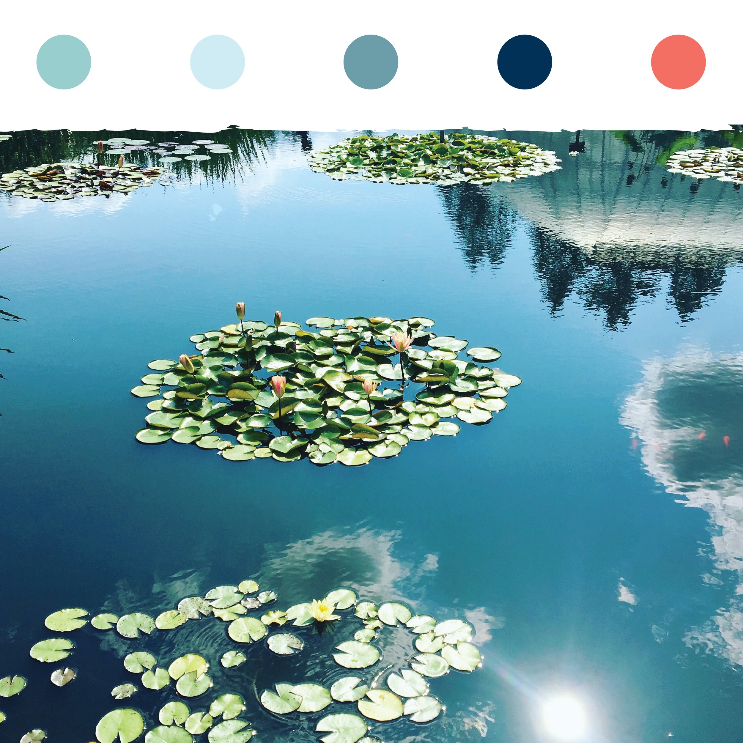
For my own branding, I used a photo that I took at the NY Botanical Gardens as my color palette inspiration. I also happen to love turquoise, water, and flowers, so it’s a win in speaking to who I am. My palette is shown below. I even used my brand color palette inspiration image as the header image of my website.

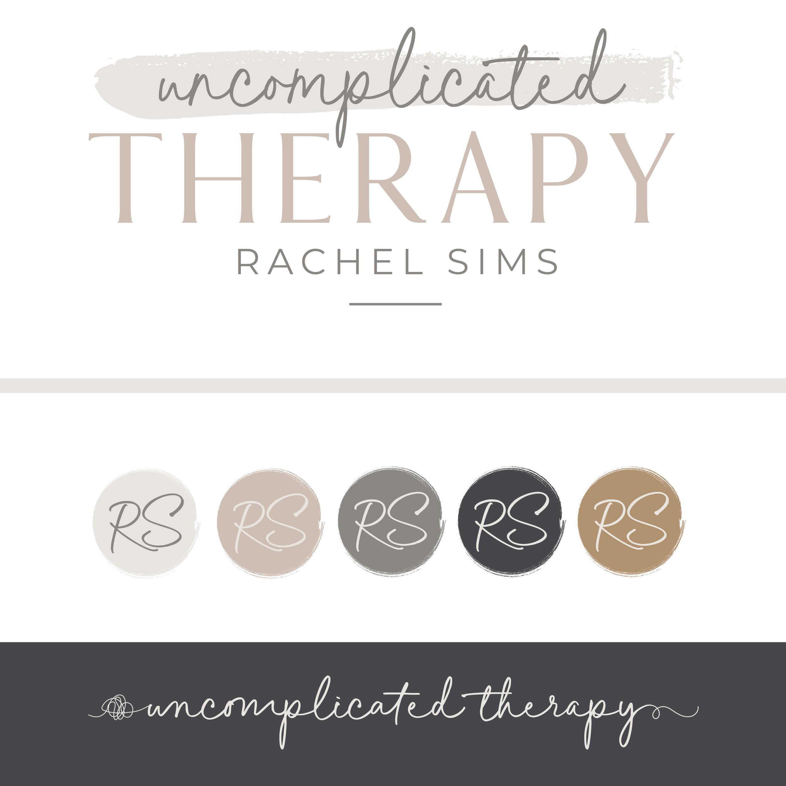
Here’s another expanse of how my client’s color palette is developed as part of the branding process, and then carried through to the elements of her brand and various applications like products social media, and website, to create a cohesive, recognizable look for her audience. See more branding for this client here.

Want to talk more about color palettes and branding? Let’s chat and see what Pfeifer Design can do for your brand!