
Museum of Early Trades & Crafts Education Annex Branding
Client: Museum of Early Trades & Crafts, in Madison NJ
Scope: branding, style guide, exterior signage for building facade and sidewalk hanging sign.
The Museum of Early Trades & Crafts is a treasury of early American history in Madison NJ. The museum is across the street from the historic James building, located at the entryway to a beautiful Main Street and one of my favorite buildings in Madison. The museum recently acquired ground floor space in the James building for their new Education Annex which will expand their ability to have programming for school groups and others. I was so pleased to have the opportunity to design a logo for their new space which would tie in to their existing logo for the museum but would mark the Education Annex as it’s own special space.

Images of the Museum of Early Trades and the existing logo and museum exterior signage. Photo credit for interior exhibit shots from www.metc.org
Challenge:
The METC Education Annex exists to expand the space and programming opportunities of the METC for further education and accessibility. The Annex needs a brand mark that will be associated with their physical space, programs and communications.
The METC Education Annex brand mark needs to show a direct relationship to the METC brand, while still standing apart as its own entity.
Branding needs to work on various color backgrounds, light and dark, and different size applications, and in lockups with other groups.
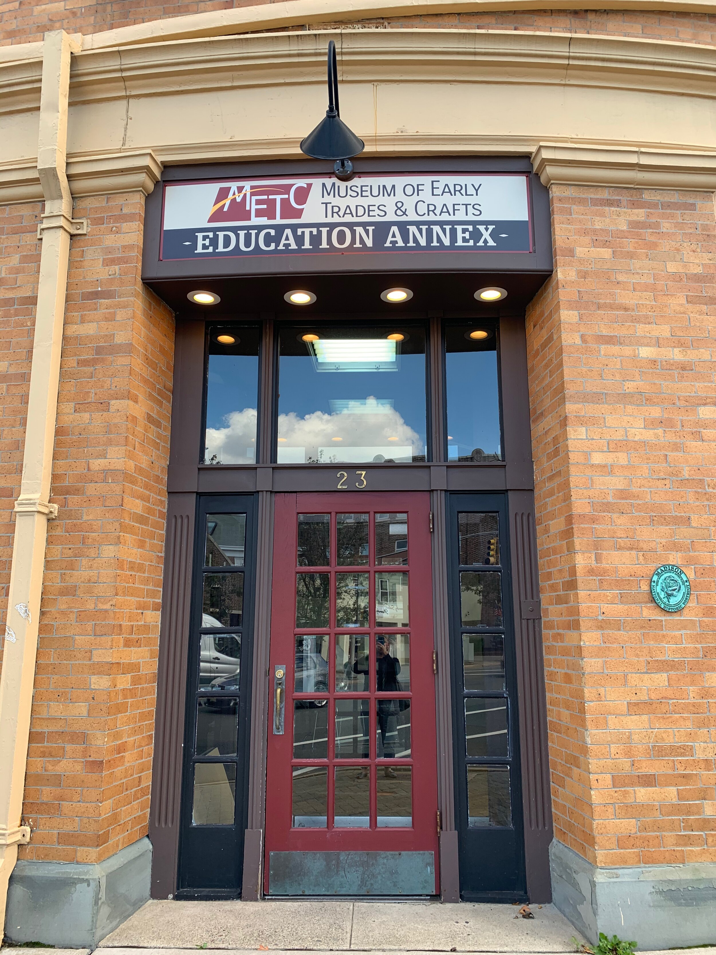
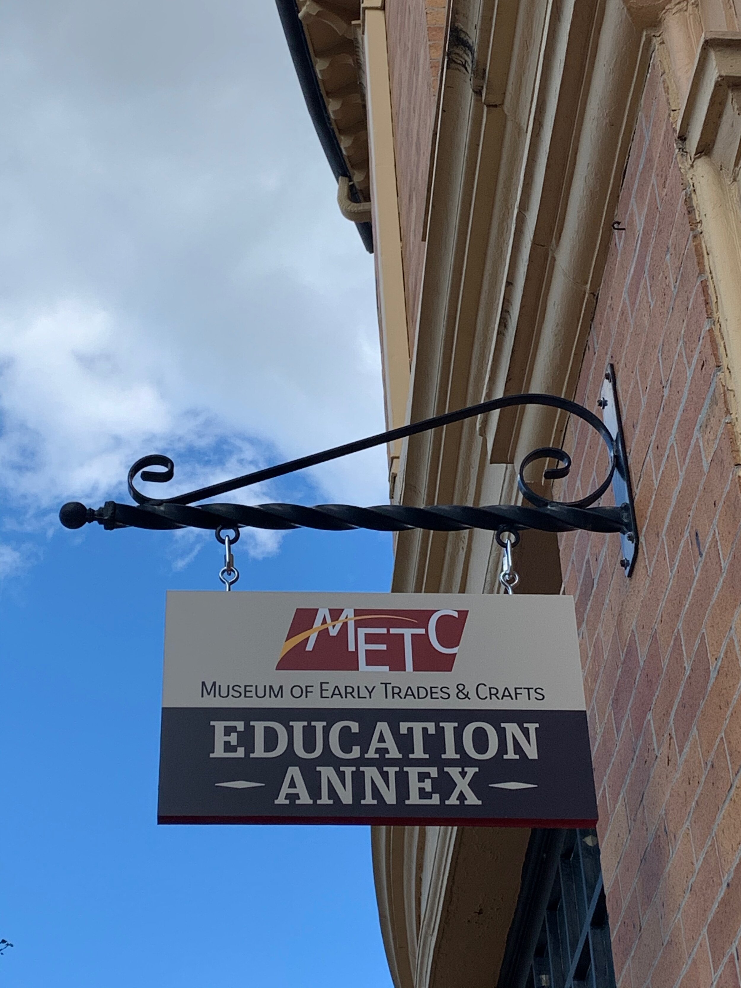
Signage needs to honor the building- it's character, historic significance and value, and enhance not detract from the facade.
Needs to stand out and be legible, make it clear who you are and what you do, express your style, and make visitors feel a positive connection with the museum.
Solution:
The primary METC signature colors and mark exists in the Annex mark to assure a strong association.
The new brand mark is clean and simple and effective and clearly states the association with the museum, while giving the Annex it’s own identity. It will work well in large and small applications and can be used in limited color applications if needed for imprints on products, etc. The shape will work easily in several applications, and will stand out easily against a colored/busy background if needed. It will work well in a lockup with other logos as well.
The Slab Serif font, reminiscent of wood block type of the early 1800’s is used for Education Annex typography, in a dark blocked area like a wood block, with lighter letters on a dark background. The black frame around the logo corresponds with the black wrought iron arch outline of the METC sign.
The logo style and coloration will coordinate with the existing METC signage and the facade of the James Building for the new signage for the Annex space.

SIGNAGE FOR METC EDUCATION ANNEX


Please contact Pfeifer Design for your branding or signage needs - set up a free 15 minute consult today!