Say what? Communicate Clearly and Confidently! Quick checks to remember when designing Communications for your business
Lets talk about designing communications! If you’re responsible for this, chances are you’re regularly wanting to get things done and out quickly — flyers, graphics, event materials, announcements. Often, they’re “fine,” but sometimes there’s a nagging question of whether they’re as clear or polished as they could be. Or worse, after distributing, you discover a glaring error that wasn’t so glaring while you were looking at it a hundred times while putting it together. Hey, I know this isn’t critical or rocket science — but if you’re spending money or putting something out for the public eye, you want it to be “right,” right?
Most materials that look a little off — whether printed or posted — often are because assets (think logos, colors, fonts, images) are being used in ways they weren’t originally meant for: images stretched out or low resolution, logos pulled from websites or emails, or layouts copied across formats without adjustment.
For a quick check before anything goes out, here are a few things worth reviewing.
📣 For clarity and message
Is the main message obvious at a glance?
Is there only one primary action or takeaway?
Are dates, times, locations, and URLs consistent (and correct) everywhere they appear?
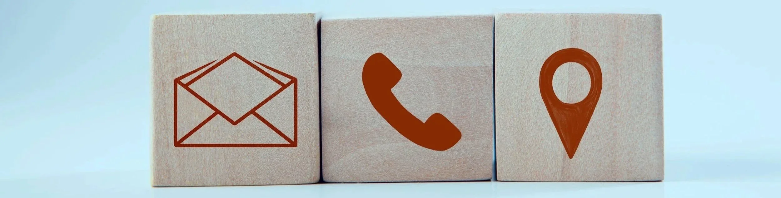
The who, what, when, where why, how… test – are you answering, somewhere, the questions that your audience might have?
🦋 For Aesthetics
Coco Chanel once said, “Before leaving the house, remove one piece of jewelry.” Hey- I do like bling! 💎 But I think it’s helpful to apply this to your communications by editing for clarity first—then intentionally choosing where and when to add personality, rather than decorating everything, so that the right elements stand out.
📰 For print
Are images high enough resolution for the size they’re being printed?
Is text safely away from the edges (nothing feels cramped)?
Do colors still look as intended when printed, not just on screen?
Have you checked with your printer for any trim, bleed, color format, or resolution requirements, etc.?
📲 For posting
Is everything readable on a phone without zooming?
Is important content clear even if the image is cropped? (this especially relates to differnet social media platforms, where one size doesn’t fit all.
Is there enough contrast for different screens and lighting conditions?
Is anything looking pixelated, blurry, or unclear?
Have you saved your file at a size small enough to load quickly, but large enough to look as intended?
A few minutes spent here can prevent the kind of issues that unfortunately show up once something is already public.

An example of a digital campaign for social media, that breaks down the necessary information in an organized way, to draw attention to what the viewer needs to know- the who, what when, where, why…

A social media post with clear details, guiding icons, and clean logos and resolution gives a polished, professional message.
👩💻 File format tips
Print: use PDF, TIFF, or high-resolution JPEG to preserve quality.
Web/posting: use JPEG or PNG — JPEG for photos, PNG for graphics with text or transparency.
👁️ Quick resolution rules
Print: aim for 300 DPI at final size — this keeps images crisp on paper.
Web/posting: 72–150 DPI is usually fine, but make sure files are large enough to display clearly on screens without being too heavy to load.
Hope that gets you on your way to sending off all your messaging with confidence and clarity!